I'm feeling the blues today - hence the blue ink (how profound!!). Without dwelling on all my woes, which we all have, I will continue to write up this project which I enjoyed. My only woe I will share is that this 'crappy' weather means no photography. My attempt at photo-journalism and photographing the aftermath of the floods just feels wrong to me. Instead, I used my morning to collect up lots of clothes, towels, bedding and toys and delivered them to the flood relief centre. That feels more right to me.
Anyway, I'm lacking material at the moment given many other distractions. But this idea of balance really appeals. I like symmetry and balance, circles and finished lines!! The project required you to take half a dozen of your own photographs and decide how the balance works in each one. It doesn't matter whether the main elements in the picture are masses of colour or tone, arrangements of points and lines. What seems dominant in the pictures?
Image 1
This was taken in Cockermouth several days after the flood. It was taken fairly quickly and with a road between me and the bus I didn't have much option in terms of where to stand. I mentioned previously and I still struggle with this, is how to focus the eye when there is so much 'noise'/congestion in a picture. This is a classic example, the tree adds nothing to the picture but in terms of balance it is very dominant and therefore I composed the picture with this in mind. Also the background is distracting. I have already used a shallow dof to focus the camera on the bus. In terms of balance, the bus is the large focal point and takes the larger part of the image.
Image 2

Indoor shots have been the order of the day. Image 2 will be used for my christmas cards hopefully. It is three composite images put together. As I do not have a studio kit and it was a very wet, dull day when I took the photos the background came out grey and not white which is what I wanted. So I have had to increase the exposure significantly, increasing the blacks and contrast, and reduce brightness. This creates a high-key effect which I like although unfortunately with this manipulation I have lost some quality and realism. Composition and the rule of thirds does intrigue me when it comes to portraits as I find the rules harder to apply. Although in image 2 it is straightforward as there are three subjects. My eldest child is taking up the most space on the right and my youngest is sat lengthways so the balance is symmetrical. However, I am still confused when it comes to a portrait of one person. In most 'head' portraits, the subject is in the middle of the frame unless the environment has something else to offer. But this then makes for a static image doesn't it? While I'm writing this, I am beginning to recall some diagrams of the Mona Lisa and the golden section - aah yes, here it is. But this does follow the rule of thirds, the head is in the top third of the picture. What about this twiggy portrait, yes this does too. And the Afghan Girl, Sharbut Gula (National Geographic 1985), mmm, not central either. Keep going. This Jack Nicholson portrait is slightly different. It is such a close-up that the face is central in the image. However, the focus in the image is the eyes which is not central and again, follows the golden section. So, for portraits, it seems the golden section is still followed either by including a certain amount of the body for the face to be off-centre or close-up so the point of focus is not central.
I've gone off the point a little. Moving on to image 3.
Image 3
To start with, image 3 interests me from a balance and golden section perspective. Firstly, I was concerned that I sliced the image in half which compositionally should be weak. I guess from a balance point of view this works. However, I still really like this image despite the central cut between the two sides of the building. I think perhaps why it may work is that the windows and various floors of the building are not central and create pattern and further interest between the two sides.
An alternative of the same image is below:
Image 4
Image 4 is not sliced down the centre. I have moved it to the left in order to 'fit' the rule of thirds more closely. The balance still works as the larger, cream building is dominant. This should, according to the rules work better from a balance and compositional perspective. But I don't like it as much.
And finally Image 5, a reject from assignment one, at first glance shows equal balance on the scales. I should be happy with this, however, I am concerned that in many of my shots I do cut the image symmetrically, either horizontally for horizons or for portraits and studio shots. This does sit uncomfortably with the rules of thirds. I am hoping that the following section of the course will help with this.
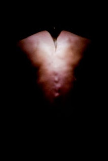
Images such as the Arbus Identical Twins image seen here uses symmetry to assist the viewer in seeing the differences. However, Bill Brandt (1904-1983) who was a master at both portraiture and landscape used high contrast techniques and as seen here his nude portraits use lines and shapes rather than symmetry. I need to be careful not to overuse symmetry in my photography which by nature I seem to be drawn to.


No comments:
Post a Comment